Just a short note to say that my new website is finally up! Please stop by and take a peak :)
www.sean-scanlon.com
Sean Creates It: musings of an aspiring children's illustrator
Welcome to the place where my wheels turn, or churn - depending on my mood I suppose! This is my home online, where I'll be writing about the process of trying to fulfill my dream of publishing my drawings and paintings. I hope you'll bookmark my page if you like what you see and feel free to make yourself at home - leave me a note or two. You can also follow me on Twitter @seancreatesit. (*Note: to post comments, Google requires you to enable cookies on your browser).
Friday, March 29, 2013
Thursday, March 28, 2013
Illustration Inspiration #2: How I Became Pirate
How I Became a Pirate by Melinda Long and Illustrated by David Shannon is currently one of my favorite picture books. The story is written so believably from the first-person perspective of young Jeremy Jacob, it's almost as if my own first-grader could have told it.
Writing a story and illustrating it from the child's perspective creates a welcome challenge as an adult, but when successful, makes the story relate-able for our audience (no boring books here!). Ask yourself: how does a child see the world? This is something I aim to do with my projects as I continue my own journey and has also caused me to develop a greater bond with my kids as I step back and consider their perspectives in seemingly simple matters of daily life.
As an artist, I greatly admire David Shannon's work. Admitedly, it was his beautiful, brightly colored illustrations that drew me to the book and ultimately to buy it. His paintings inspire me to hone my craft so that perhaps one day, I too will draw readers through illustrations to my own stories.
Writing a story and illustrating it from the child's perspective creates a welcome challenge as an adult, but when successful, makes the story relate-able for our audience (no boring books here!). Ask yourself: how does a child see the world? This is something I aim to do with my projects as I continue my own journey and has also caused me to develop a greater bond with my kids as I step back and consider their perspectives in seemingly simple matters of daily life.
When I read this book to my children, I find myself acting out different accents and voices for the characters, particularly Captain Braid Beard. That the book is so fun to read makes it more enjoyable for my little audience as well.
As an artist, I greatly admire David Shannon's work. Admitedly, it was his beautiful, brightly colored illustrations that drew me to the book and ultimately to buy it. His paintings inspire me to hone my craft so that perhaps one day, I too will draw readers through illustrations to my own stories.
Thanks for visiting!
Tuesday, March 26, 2013
Character Concept: Henry the Hero
After a day of brainstorming yesterday, I got to work last night on sketching out the main character for the first of three upcoming projects. In the drawings below, I'll give you a look at my sketch book.
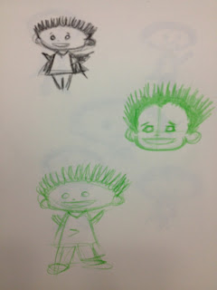
The last of many was a boy who looked like he was a rule follower like the first, but also could be a bit mischievous and curious like the second boy when the right moment presented itself. I experimented a bit with hair thickness and body lengths, as well as some various expressions and angles.
Although I liked this boy, he wasn't the right kid for my project. It's sort of like when a casting director casts an actor for a film. Many good actors audition, but sometimes, you're just looking for a certain someone to fill the role. This guy wasn't Henry ...

Since the last actor was more refined, maybe I needed to audition someone with a little more spunk. I briefly experimented with someone who looked a bit more hyper, but realized he wouldn't work as Henry either. I put him in the back of my mind for later as well.
I worked through this process a few different ways, changing head shapes, body types and hair styles.
The last of many was a boy who looked like he was a rule follower like the first, but also could be a bit mischievous and curious like the second boy when the right moment presented itself. I experimented a bit with hair thickness and body lengths, as well as some various expressions and angles.
You may notice that each sketch was drawn with a different color pencil. I think every artist is quirky in one way or another. For me, if I'm not feeling the creative love from one pencil, I switch it up and try another. I rarely have luck with black or a traditional #2 pencil, but colors like red and blue seem to help me work well. Maybe it's something strange in my subconscious?
When I felt I'd doodled enough, I started on a sketch that would be my actor for my project. As time goes on, I may tweak him here and there. I'll probably draw or paint him a hundred times more to make sure he looks consistently the same each time. Just as an actor goes through makeup and costume, so too will this boy for Henry. In the drawing below, I started with a rough sketch using a blue pencil, and then layered additional color, thinking about Henry's wardrobe. Below is an initial sketch for Henry the Hero ...
Henry is an ambitious first grader and do-gooder with enough energy to bottle it and sell it to the military to help soldiers get through long deployments. He is very concerned with what sort of job he will do when he grows up. He wants to be a hero like his Dad.
Check back to learn more about Henry and my project.
Thanks for visiting!
Monday, March 25, 2013
Beneficial Brainstorming in the Rain
I've always considered myself more of an illustrator without intent to write my own manuscripts, but it seems that working through these ideas will help me focus my artwork with my audience consistently in mind.
What helps you get through a creative slump?
Stay tuned over the next few weeks as I work through and post my progress on these projects.
Thanks for visiting!
Sunday, March 24, 2013
Sketch and Sketch Some More ...
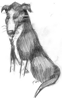
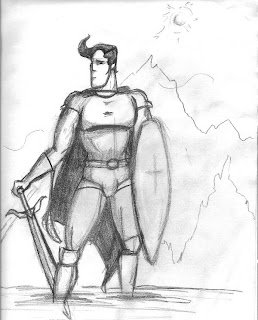
Today is a brainstorming sort of day. I have a few sketches for future projects, but nothing is connecting the dots for my next piece. It's back to the drawing tablet to keep the juices flowing ...
Meanwhile, I'm considering options for a website to showcase my art work in an online portfolio. I've seen some amazing websites like the one at www.rebeccaelliot.com, but I think I'll be satisfied with something simple for now. I'd love to hear from you if you have an online portfolio, aside from DeviantArt and the like. Who did you use for hosting, etc?
Thanks for visiting!
Thursday, March 21, 2013
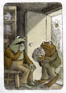
Illustration Inspiration: Frog and Toad!
This begins the first in a series of weekly posts about inspiring illustrators and their work.
For anyone who is a child of the 1980's, you're sure to remember this popular classic about two amphibians.
The award winning series about Frog and Toad by Arnold Lobel helped me transition from picture to chapter books. Simple stories about two friends with folksy illustrations are what I remembered for years, and why I purchased the books for my own children to enjoy.
Lobel's use of shadows for dramatic effect and selective use of color helped create dream-like scenes even on the edges of a page.
What inspires you?
Wednesday, March 20, 2013
My Painting Process for Prancing Pig :)
A few people asked me about the process I use for my acrylic paintings. I happened to take some photos when I painted the Prancing Pig. I'll walk through my steps below. I'd love to hear from you about your process if you're also an artist. Please don't be shy - leave a comment with your thoughts!
The first thing I do for nearly all my projects is to work multiple sketches. I experiment with different angles, color options, etc., until I find one I think would work on a larger, more elaborate scale. Naturally, this saves time, energy, and supplies during the brainstorming process. In this case, I drew a number of small sketches of pigs and ultimately selected this version of a pig happily prancing down a path.
 After transferring a rough sketch to either canvas or board, I lay down a base coat of paint to segment the background and leave areas for things I want to work in the foreground. You can see in this photo that there are varying levels of this process in place. Starting from the background, the sun is relatively well developed. I tend to enjoy working with texture. Here, I added the paint thickly and worked the brush to make the paint stand up on the sun. Because acrylic paint dries so quickly, I have to move fast to mix on the canvass, or do much of my mixing on my pallet. You can still see as you move into the foreground that the grass area is still in a base form, and the pig has yet to be worked. I've started with a variety of brown tones trying to make a well worn, mud path through the field using a pallet knife.
Here I've started to add some of the contrasting shadows on the horizon, and a base layer of pink for the pig.
The beauty of acrylics and their fast dry time is that I can paint in layers, as demonstrated in this photo. I've added texture to the long grass and tried to show it growing along the path. After all, it's well worn from years of prancing to and fro across the field! The grass itself is created using a variety of techniques, including a snipped fan brush to create grass blades when dabbing. The closer to the foreground, the more detail I add.
As I work the grass texture, I start adding the purple flowers, scattered in grow patterns throughout the field. I've attempted to create a sense of flower batching, as wild flowers bunch in the wild. I also added some more layers to the dirt path, including a few pebbles here and there, and some grass growing stubbornly at the center in the foreground.
Finally it's time to start on the pig. I include initial shadows and highlights that cause the pig's features to take shape. I may work a face a few times during this process to get a look or feature just the right way.
I then add additional details to nail down the more defining features.
Because (even pig's) skin has varying tones, textures, highlights and shadows, I add a few more highlights and brush angles. Depending on the desired texture, I may use a lot of paint on my brush (as I did with the sun) or just a little, like on the pig's brow. Just as I work the broader painting from back to front, I do the same with the main subject.
Finally, the finishing touches complete the project. Although
not the technical artistic term, I like to think of my paintings as
surreal. Vibrant colors accentuate the ordinary. Bold brush strokes for a
preference for texture over gritty detail create dream worlds not
found in reality.
Thanks for stopping by!
Subscribe to:
Comments (Atom)


